A train station’s style has a lot to say.
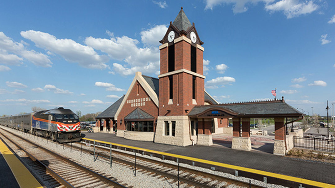
Literally and figuratively, train stations connect municipalities. The station is the gateway to the tracks that lead people to other places. It is the face that a city or village shows to commuters, and, in many cases, an embodiment of a community’s values.
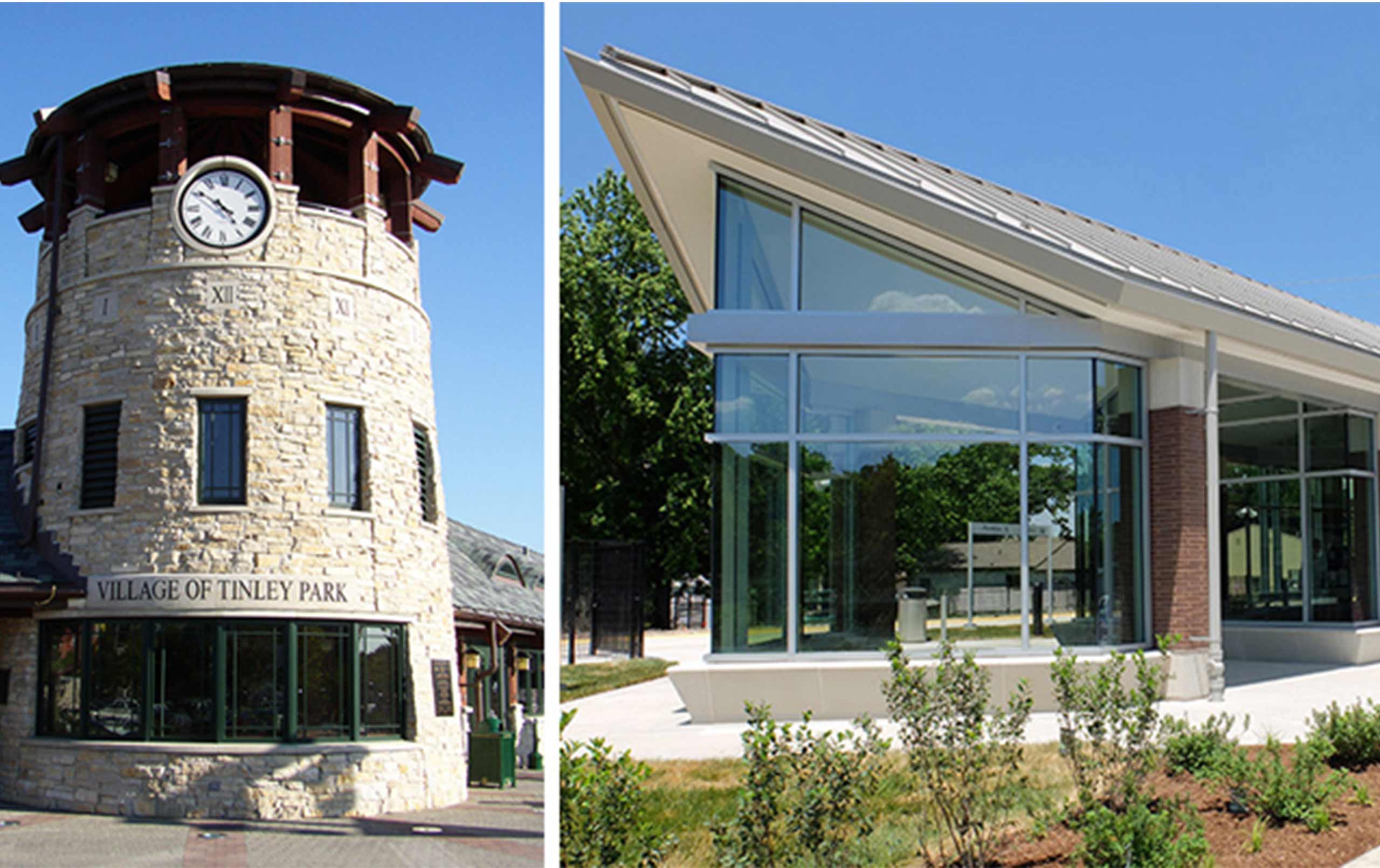
Midwestern stations adopt a variety of styles, ranging from the democratic idealism of Thomas Jefferson’s American Colonialism to the simple geometries (and sometimes even starkness) of the Contemporary Style. Every style has a unique “vocabulary” consisting of form (i.e., wall surfaces and roof), materials (e.g., brick, stone, precast concrete, metal), and spatial relationships. Each vocabulary marks a time in history. Some municipalities elect to pay tribute to the past, while others choose to invent a new vocabulary that captures their own moment in time.
During a 30-year relationship with Metra (Chicago’s commuter railroad), I’ve had the opportunity to learn and “speak” many vocabularies via design. In this series, I will share “translations” of several train station vocabularies and draw from case studies from throughout the region. Examples include American Colonialism, Richardsonian Romanesque, American Arts & Crafts, Prairie, and Contemporary.
So whether you prefer the brick and stone masterpieces of yesterday, or the glass and steel wonders that point to tomorrow, get on board. It’s going to be a fun ride.
Contact us to learn more about train station design.


