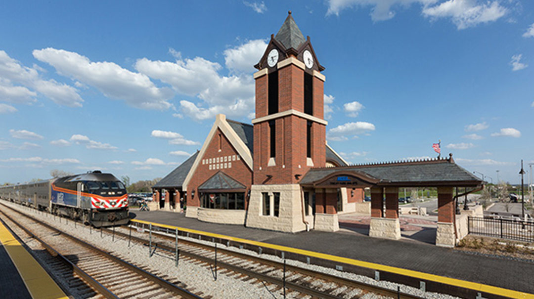
If safety is the number one priority for train stations, then accessibility comes in at a close second.
Have you ever wondered about those little bumps you see on sidewalks just before you get to a cross street? Those of us in the architecture/engineering/construction industry call them truncated domes, and they’re there for a reason: when those with vision impairments feel those bumps on their feet, they know the street is near.
If you’re a train commuter, you’ll also encounter those bumps on the two-foot wide warning strips on either side of the tracks. These are just one of many measures that help make train stations as safe and maneuverable as possible for those with disabilities. Accessibility takes into account the walking-impaired and those in wheelchairs, as well as the sight- and hearing-impaired. Train station design needs to meet the Department of Transportation’s ADA Standards for Transportation Facilities. Then there are the state requirements, which may add a little twist.
Many people think accessibility is just about wheelchair ramps. It isn’t. Accessibility covers everything from the approach to the tracks to the toilet rooms within the stations. Among the many things designers have to consider are handrails, what’s sticking out of walls (we wouldn’t want the sight-impaired to bump into anything), and surfaces (e.g, slope, visibility, maintenance requirements). And there’s so much more.
Universal Design and Grade Separation
Many people don’t notice the accessibility elements that are all around us. That’s a good thing. Architects should strive to design train stations that are inherently accessible to all without drawing attention to any specific group. We call this “universal design,” and one of the challenges where it often comes up is “grade separation” of pedestrians and train tracks.
Ideally, commuters should not be crossing tracks to get to platforms. Designers achieve this by sending them to a different level, or grade, to access their platform. Most often, this diversion comes in the form of an underpass. For instance, on my way to and from stops along Chicago’s Metra line, I often have to use an underpass to access a platform for “inbound” or “outbound” trains.
The question then becomes . . . how can we make that underpass experience as pleasant and convenient as possible for all who use it? A switchback ramp can do it, but that is often unsightly and draws attention to itself. Typically, we avoid elevators since they are cost-prohibitive from a long-term maintenance standpoint. And as soon as elevators don’t work properly, they’re in violation of the Accessibility Act.
When confronted with grade issues, I often advise building owners to keep it simple: go with the most easily accessible, least costly, and least mechanized way of dealing with it.
Following are a couple examples of train stations that creatively address grade separation and accessibility.
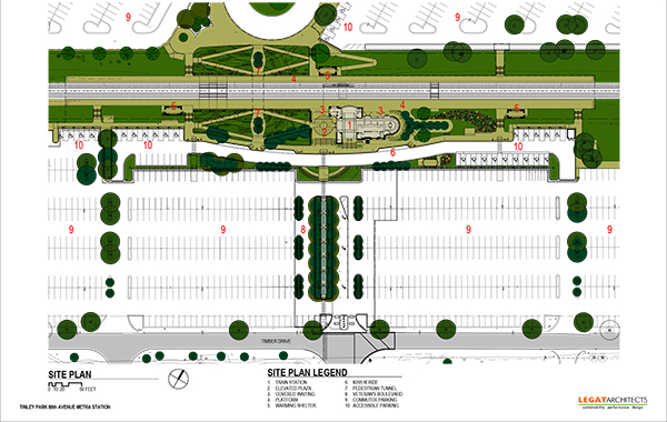
A Pleasant Transition in Tinley Park
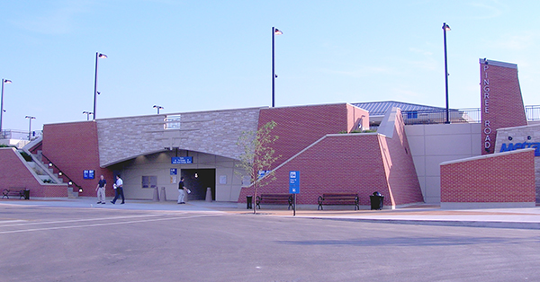
When we designed the new Tinley Park 80th Avenue Train Station, there was a track-level crossing that the village and Metra wanted to eliminate by putting in a pedestrian underpass.
Instead of using a switchback ramp leading to the underpass, we created a kind of sunken garden landscaped with rock outcroppings and vegetation. A system of ramps guides all commuters through the garden and down to the underpass, then back up again on the other side. This took what could have been an eyesore and turned it into something exciting. It doesn’t feel like you’re going down into a hole. And for those in a rush, there’s still a stair leading to the underpass.
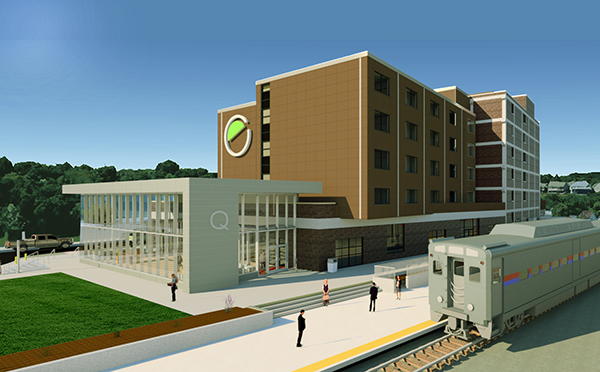
Mind the Gap in Moline
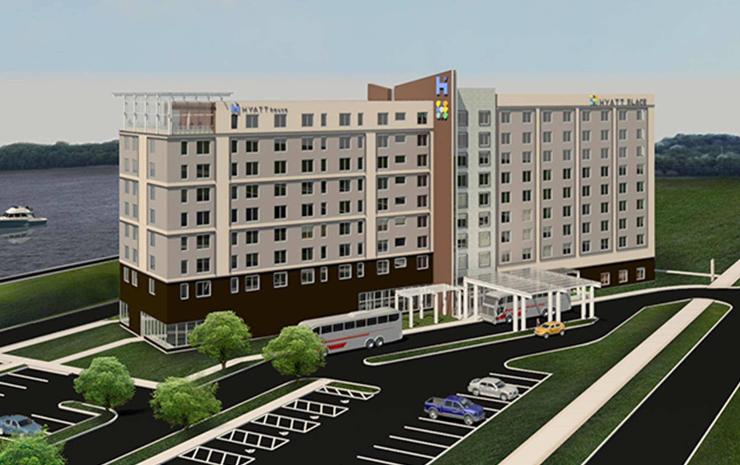
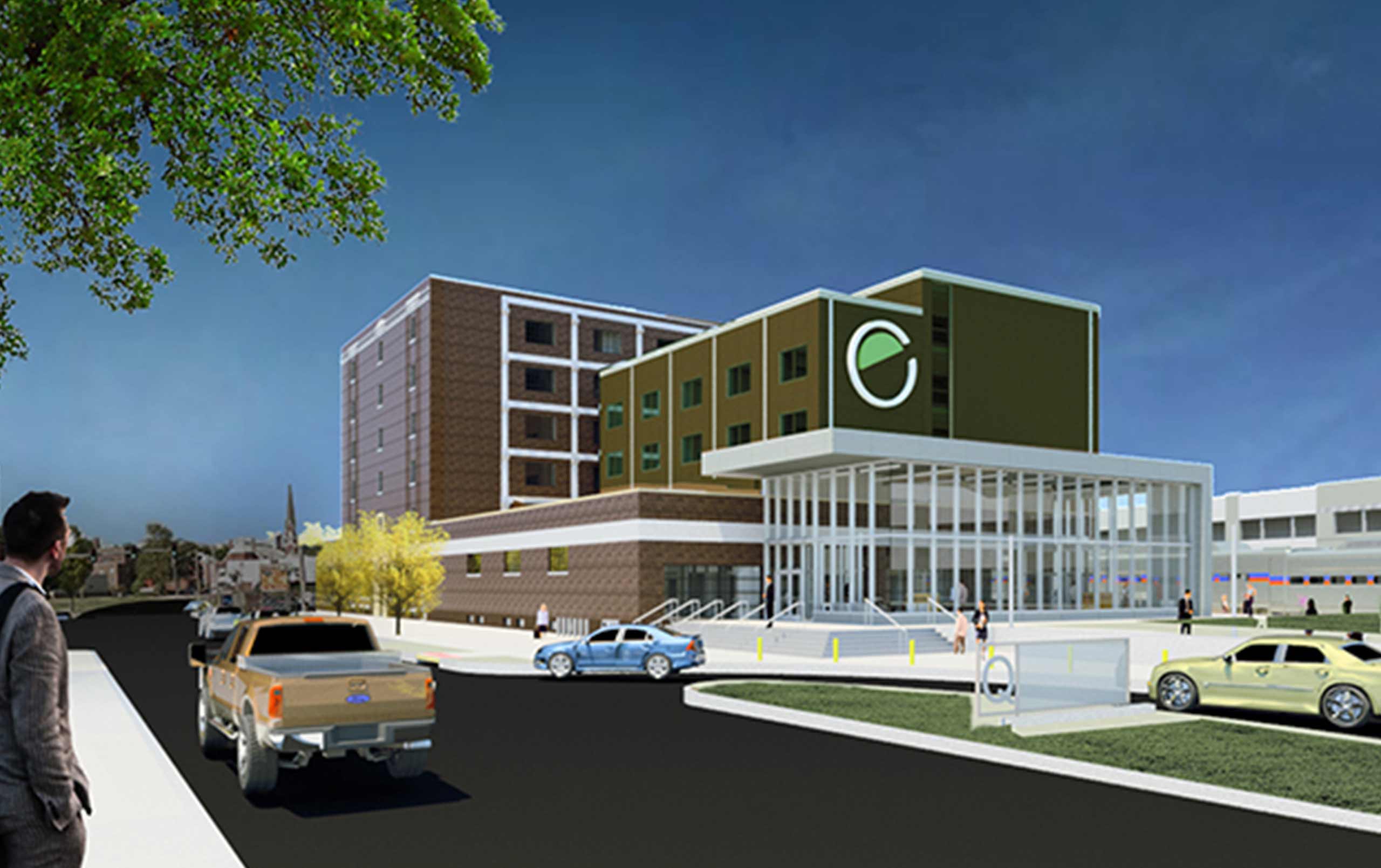
Sometimes, accessibility challenges with grade separation come a little closer to the building. For years, freight trains stopped right next to the O’Rourke Building in Moline, Illinois to drop off shipments in the warehouse. That meant a four foot gap between the ground floor of the building and the tracks.
When we got the call to transform the historic facility into a multimodal train station and a hotel, we faced a challenge: how do you get everyone up from the platform to the facility without making them feel like they’re climbing a ramp?
The answer came in the form of a promenade between the building and the tracks. Regardless of whether they have disabilities, people will enjoy the landscaped walkway that leads to a public plaza, the station’s great hall, and the hotel lobby.
Both the Tinley Park and Moline projects show how universal design benefits everyone.
See Ted’s other posts about train station architectural design fundamentals: A Community Model, Safety above All Else, An Activity Node, Tough and Timeless Materials.
Contact us to learn more about train station design or comment below to share your thoughts on this post.
