Community-sensitive police station design strikes a careful balance between aesthetics and budget
What’s it going to cost? This is one of the questions that architects get asked most often. It’s especially relevant to police stations, whose construction budgets face constant public scrutiny. The challenge for architects, therefore, is to design a station that is both attractive and respectful to taxpayers.
In our previous post on police station design, we talked about the importance of the contemporary police station showing a strong, yet friendly face to welcome its community and maybe even set a design standard for future facilities. How can municipalities create a civic asset like this without spending a fortune?
A police station has less public traffic than other municipal buildings such as village halls. The general public rarely or never sees many parts of the police station. The trick for designers involves devoting more construction dollars to areas that are highly visible to the community, then pulling back on materials and details (but not quality) in the less public areas.

Resourceful in Arlington Heights
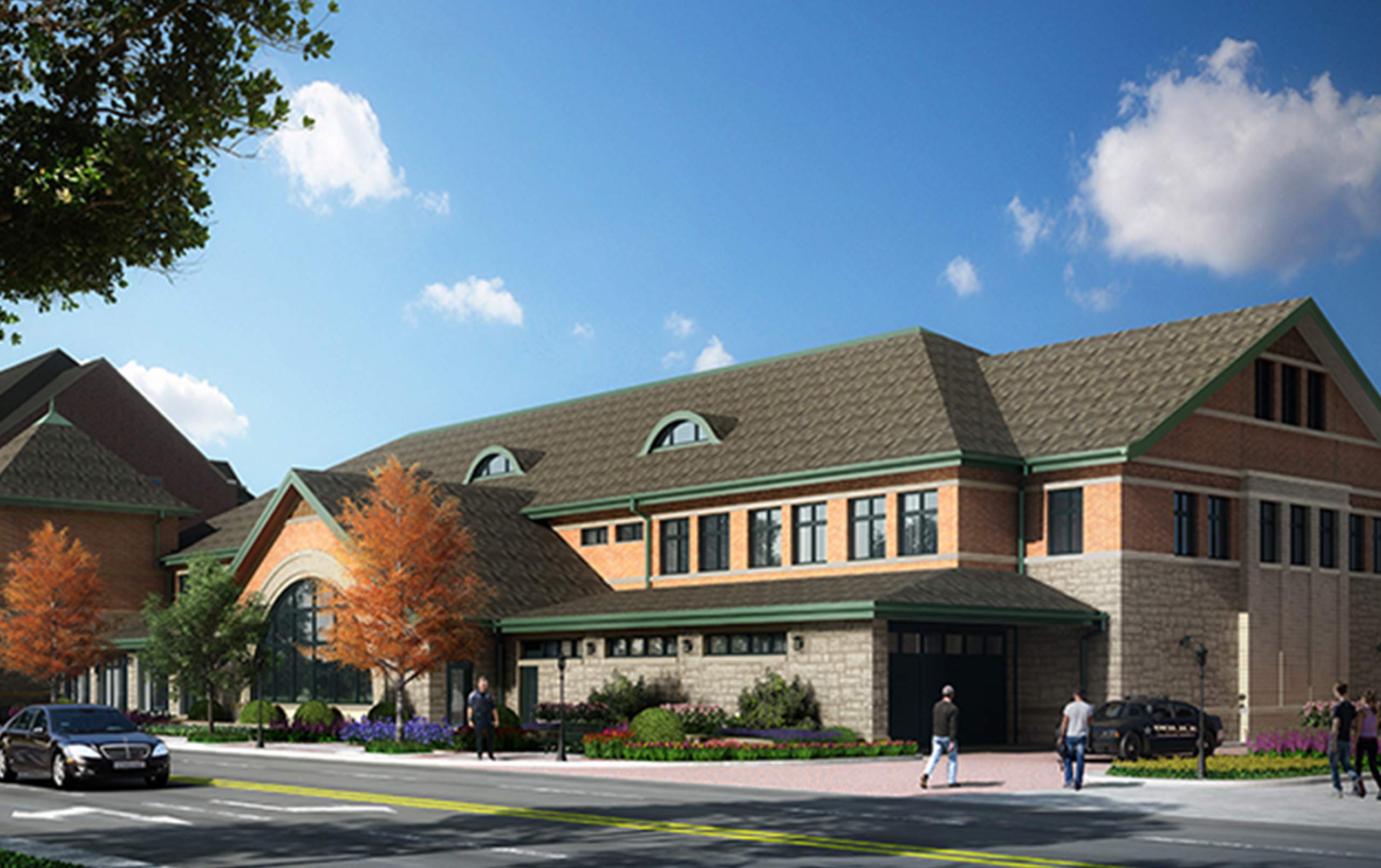
Legat Architects worked closely with an architectural review committee to set standards for materials and details for the new police station now under construction in Arlington Heights, Illinois.
For the exterior, more resources were allocated toward the east, west, and south façades that face the community. These three sides feature a masonry façade with a stone base and arches, as well as detailed windows. They pay homage to the historic style of the adjacent village hall and fire station that bookend the station. The village saved construction dollars by adopting a more utilitarian look on the less visible back of the police station.
The inside of the station breaks into three different zones: public, police, and public/police transitional areas.
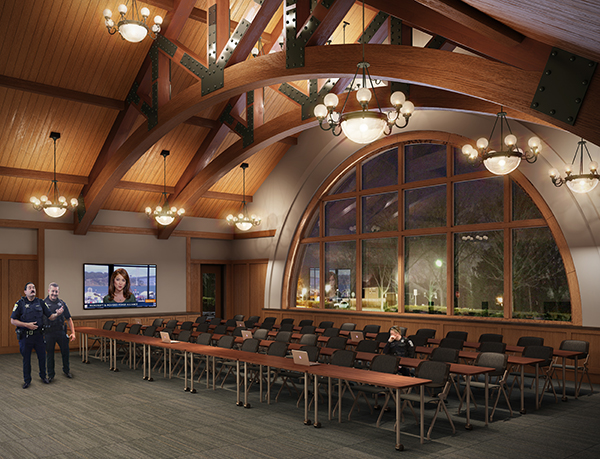
First floor public areas (e.g., entry vestibule, front desk, corridors, community room) carry through the historic character of the exterior. Among the details visitors will encounter in these areas are stone, structural timber and wood trusses connected by steel plates and bolts, wood benches, historic-looking chandeliers, and custom cabinetry to display police memorabilia.
Conversely, the basement, some of the ground floor, and nearly all of the second floor are geared exclusively toward police work—they don’t require the same historic gestures as the more public areas. For strictly police areas, we created a clean, professional look consistent with a high-quality 21st century office facility. It’s a welcome change from windowless offices with cubicles jammed together, poor ventilation, and no natural light.
Then there are the areas such as the front desk and records counter where police and public functions overlap. Here we specified finishes and materials that transition between a historic and functional aesthetic. For instance, when guests approach the front desk, they encounter contemporary technologies housed within a more historic enclosure. The light fixtures in this area bridge the gap—they appear more utilitarian than chandeliers, but more decorative then the lighting used in the police functions.
The Arlington Heights station treads the line between aesthetics and budget by giving residents a welcoming, rustic municipal building, and giving law enforcement staff a professional working environment.
Read our other posts on police station architectural design: Community Connections and Site Selection.
Contact us to learn more about police station design, or comment below to share your thoughts on this post.


