How to avoid navigation frustration: interior design that intuitively guides users through a space
Last time, I revealed some of the techniques interior design uses to fool the eye. This time, I’ll explore how design can help support wayfinding (i.e., how people find their way through a space) and therefore improve the user experience. Colors, materials, furniture, ceilings, and floor patterns all play a role. Ideally, it will be intuitive . . . visitors will know where they are and how to get where they’re going without asking, and maybe even without signs.
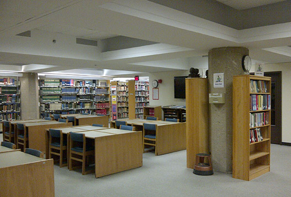
One example of a space that transformed from dated and confusing to welcoming and easy to navigate is Governors State University’s (GSU) library. The library had seen little change since the 1980s. It was hard to find it, and hard to get around within the space.
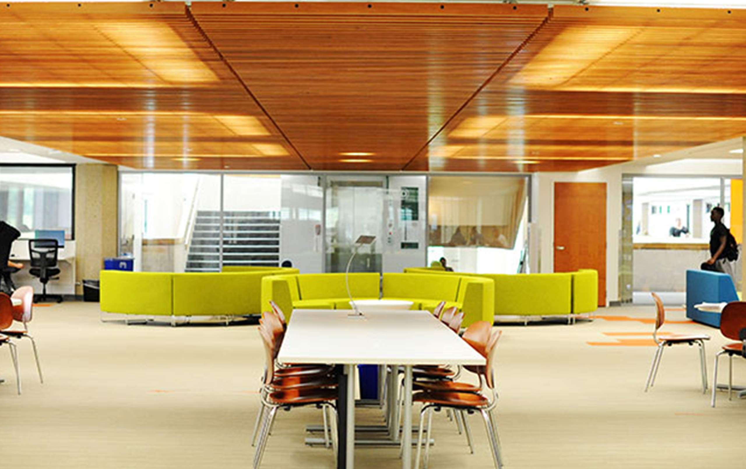
A complete gut and renovation transformed the dark, mazelike environment into a vibrant, open learning setting.
Identify the Destination
We’ve all been in this situation: you arrive at an unfamiliar building and you can’t figure out how to get to your destination within that building. GSU faced this challenge with its second-floor library.
“Initially, when you looked up from the atrium, it was hard to tell that the library was up there,” said project manager Michael Lundeen. “And when you got up there, you walked along a vacant narrow corridor leading to the library.”
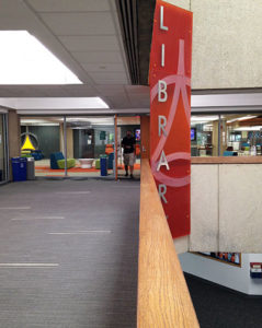
Today, a large red “Library” sign visible from the atrium’s lower level serves as an invitation to a new, energetic library space; there’s no longer a question about the library’s location.
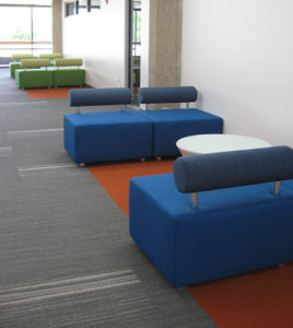
On the second level approach to the library, students interact in breakout spaces with colorful furniture along the corridor that leads to large glass walls exhibiting the technology, furnishings, and activities within the library. Movement, color, energy. Key elements to create interest and engage students
Before students even step foot in the library, the design not only guides them there, but entices them about the energy awaiting within.
Pave the Path
Once visitors reach their destination within a facility, how do they find what they’re looking for? This question is especially relevant if it is a larger space.
When students entered the old GSU library, they were greeted by concrete columns and row after row of tall bookshelves. It had a dated feel, and it was easy to lose sense of where they were.
The revived library features a new wood slat ceiling in the lounge area just inside the main entry. The wood, which is also visible as students ascend the stairs outside the library, softens the grid lines from the concrete and creates a cove where tables and seats of different shapes and sizes welcome both independent and group study.
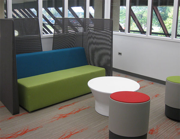
Color also plays an important role in wayfinding. Before the GSU renovation, a mostly gray color palette, nondescript furniture, white walls, and the many concrete columns made navigation difficult. So we added color . . . especially within the furniture.
Charcoal-colored walls visually organize the space, direct traffic flow, and draw attention to gathering areas with bright seating.
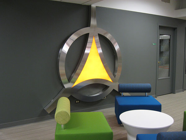
The furniture is easy to see and it orients the students. This is especially evident at the library’s core, where the bright furniture bangs out against the dark gray wall. The arrangement of furniture even resembles the GSU logo!
Destination Achieved
Interior design can transform a hidden, disconnected space into a vibrant, open hub that displays a destination and guides users through a space, and therefore dramatically improves their experience.
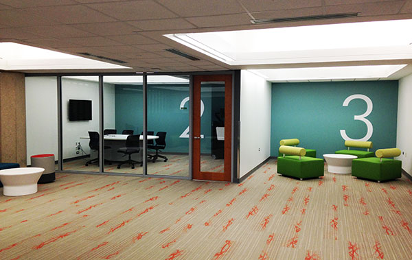
Just look at Governors State University’s library. Since completion, peer-to-peer interaction has improved and “library anxiety” has decreased. More students are coming and staying. They enjoy the glass-enclosed study rooms, the lively gathering areas, and the multimedia tables. And just as important, they know how to get to those spaces.
Contact us to learn more about how interior design can help make your space easier to navigate or comment below to share your thoughts on this post.
