Renovation of 50-year-old library building breaks down the barriers and brings in the light to create a “third place” at the heart of Harper College’s campus.
Harper College’s Library, built in 1969, had not had a significant renovation in over 20 years—several portions of the building and its systems had been virtually untouched for nearly 50 years. Like many older academic libraries, its focus was on maximizing collections. Views to the outside were hard to come by, and finding certain areas proved difficult for students.
But Dean of Resources for Learning Njambi Kamoche and many of her coworkers had a vision of what the Library could be. “Take the walls away,” she said during 2014 programming meetings. “Take down the barriers.”
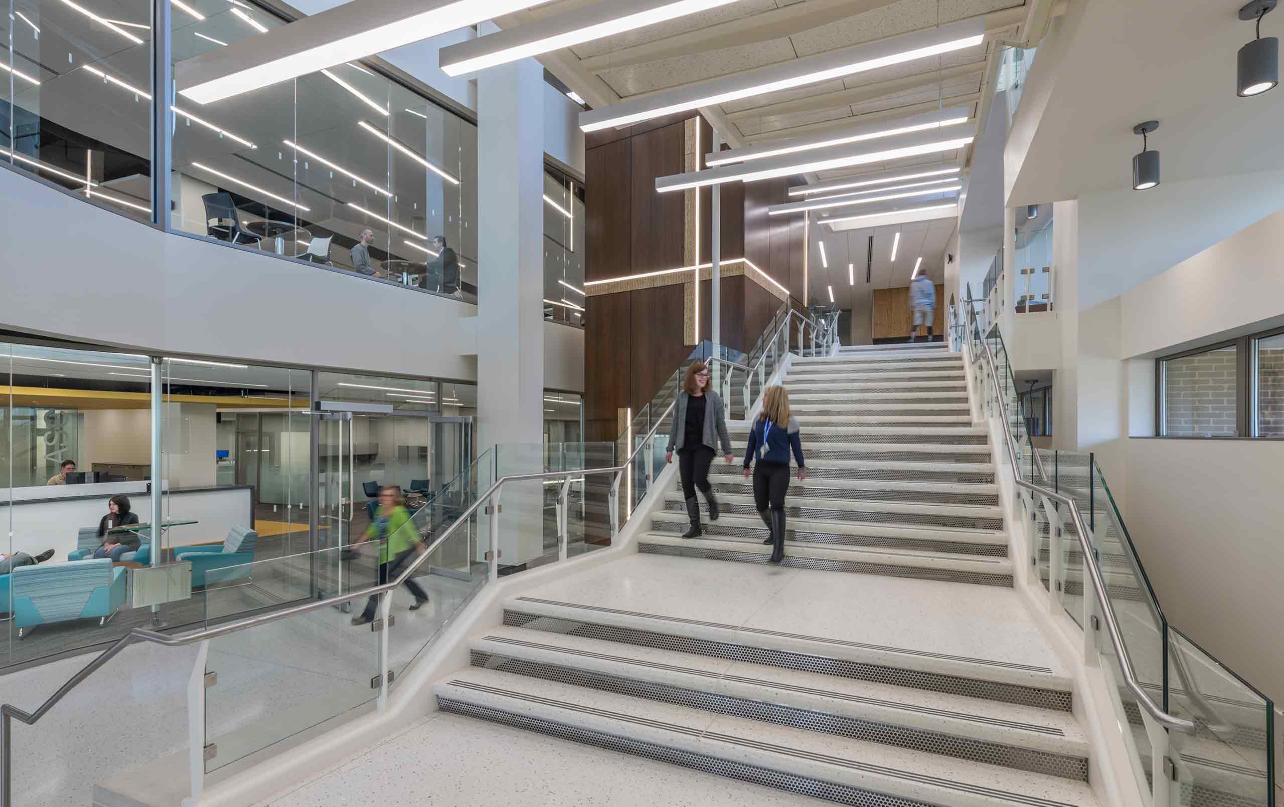
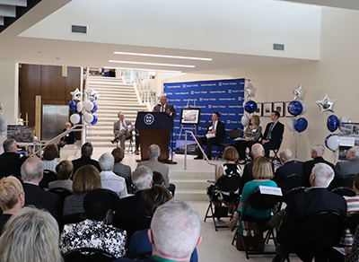
On May 3, 2018, Kamoche joined many members of the Harper community in the new “learning link,” a spacious, light-filled atrium that displays a renovated Library completely unrecognizable from what it once was. The reason for the assembly: to acknowledge the transformation and rededicate the building as the David K. Hill Family Library.
Board of Trustees member Diane Hill spoke about her late husband David (a former trustee and the Library’s namesake) and his extensive involvement with the Harper community. She said the Library is the intersection of three elements of David: his passion for learning, his passion for collaborating, and his engagement with the community.
After the ceremony, guests experienced everything from lounge-like gathering areas to glass-enclosed study rooms and “makerspaces” sprinkled throughout the 107,000-square-foot facility. They also witnessed the ultimate result of these changes: Harper students interacting and creating.
The renovations, designed by Legat Architects and built by Pepper Construction, use natural light and transparency to put the spotlight on learning and collaboration, and create an activity hub at the center of Harper’s campus. Construction started in November, 2016 and finished in March, 2018.
Dr. Kenneth Ender, president of Harper, said, “This was one of the most complicated projects this college has ever known, and it was brought in three months ahead of schedule.”
The David K. Hill Family Library comprises three key program areas: the Academic Support Center (floor one), the Library (floors two and three), and the Academy for Teaching Excellence (floor three).
“It’s not just a physical transformation, but also a philosophical transformation that is manifested in this new building,” said Brian Knetl, associate provost for interdisciplinary student success at Harper. “The Library has evolved into a place for people to gather, to connect, and to create.”
And the evidence is in the attendance. Dr. Ender said, “We had trouble not long ago getting students into the Library, and now it’s a busy place every day.”
Fast Facts
- Square Feet: 107,000
- First Floor: Academic Support Center (Writing Center, Tutoring Center, Success Services), Library Technical Services
- Second Floor: Library
- Third Floor: Library, Academy for Teaching Excellence
A Flip-flopped Setup
Scott Steingraeber, project manager at Legat, said, “We wanted to create an open feeling, while respecting the Library’s function and the students’ needs for both group interaction and quiet study.”
That was the challenge that the Harper/Legat/Pepper team set out to overcome when design started in December, 2014. Programming sessions gathered the input of many departments: the Library, The Academy, student leadership, Academic Support Center, Campus Security, Facilities, IT, Maintenance, and several others.
The team also toured regional academic libraries, including facilities in Pennsylvania and Michigan. It was during one tour that a technical services Library employee said that Harper’s renewed Library needed to become “a beacon, a welcoming place for students and staff, and an easy place to find.”
The entire building, excepting two brick stairwells, exterior walls, and mechanical rooms, was stripped down to the concrete structure. Replacements included all mechanical, electrical, and plumbing systems, as well as all windows.
The renovation reverses the original building stacking, moving the Academic Support Center from the third floor to the first floor, and the Academy for Teaching Excellence from the first to the third. The Library proper moves from the first and second floors to the second and third floors.
Connect and Create
Educational standards for libraries have evolved since Harper’s Library received minor renovations two decades ago. The progress of the Internet, for instance, changed the way that students research, absorb, and retain information.
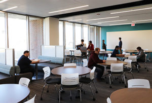
“During the pre-Internet age, academic libraries emphasized content storage and consumption,” said Jeffrey Sronkoski, Legat’s principal in charge of higher education. “Today, the Library is a place for students to gather and create content.”
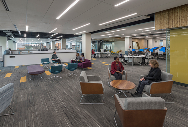
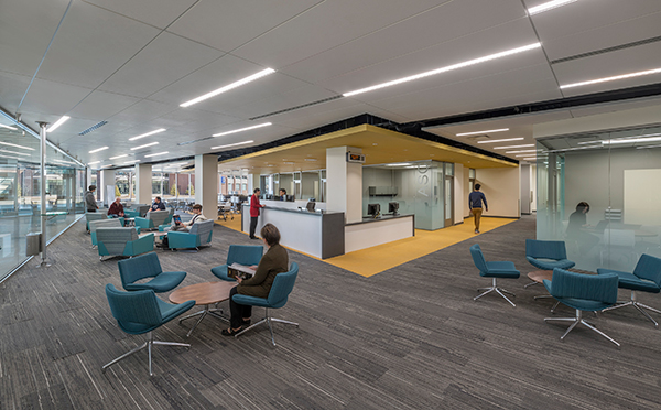
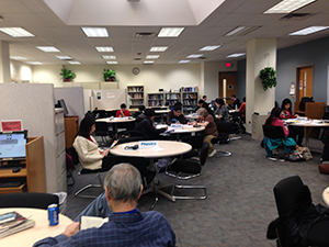
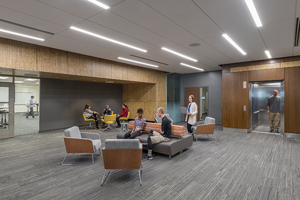
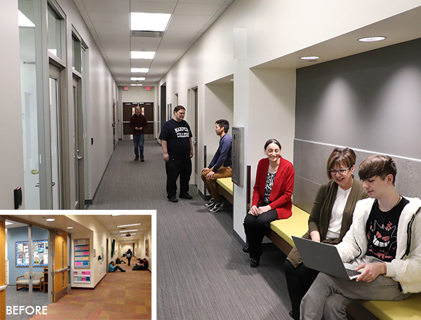
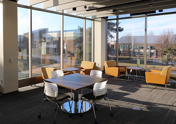
Harper’s renewed Library gives students many choices for places to congregate: soft seats and sofas, bar-height tables, round tables, booths, standard computer carrels, benches built into walls, private nooks, and even tiered modular seating against walls. These diverse seating options mark a big change from before, when some students sat on the floor with their backs against walls as they waited to see a tutor.
But collaboration is just half the story; the other half is creation. One of the first things students notice when they enter the Library is a glass-enclosed room with bright yellow walls and a big, bold sign that says, “The Make Shop.” This is the content creation lab, the soon-to-open makerspace that offers a 3D printing service, color plotter/printer, vinyl cutter, laminator, and other tools ranging from high-tech to no tech. Additionally, a recording studio allows student teams to use audiovisual equipment to practice, record, and analyze their presentations.
Harper’s renovated Library also supports the more student-focused role of staff. Knetl said, “Students have more space to interact with our faculty librarians, whose work has transformed over the years and become less about helping students find a book, and more about facilitating the creation of knowledge through responsible and reliable use of information.”
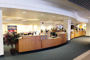
One place where this shift is apparent is the Circulation desk. The pre-renovation Library had a main circulation desk that Sylvia Kowalk, Legat principal and director of interior design, called “humongous.” Today, the much smaller combined Circulation/Research Assistance Desk, set back from the entry and surrounded by comfortable furniture, removes the intimidation factor and becomes a more welcoming spot for questions. It also suggests that staff are just as likely to be moving around teaching research strategies and digital tools than they are to be behind the desk.
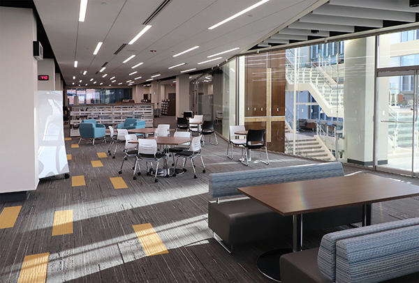
Like a Mall
Celebrated architect Louis Kahn had a concept for the renowned Phillips Exeter Academy Library (Exeter, New Hampshire), built in the 1960s: “A man with a book goes to the light. A library begins that way.” Thus, the student would get her material in the dark parts of the library, then head to the light-filled reading room.
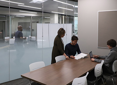
Such was the case with Harper’s pre-renovation Library, where students’ favorite places were along the widow wall. However, the Library’s tall shelves and many walls gave it a closed-off feel deeper into the space.
According to Sronkoski, the Harper Library team tweaked Kahn’s maxim to create its own design precept: “Everyone goes to the light to connect and create.” The goal was to inject the entire Harper Library with the same airy, bright feel as the reading room.
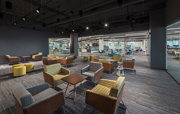
Kamoche, a staunch advocate of transparency, wanted the Library to be “like a mall, where you can see everything around you.”
The revived Library complies with much longer vistas—the second floor, where shelves dropped from seven to four feet and glass walls abound, offers end-to-end views. The stacks on the third floor are still seven feet, but they’re arranged so that more daylight can penetrate the space. On all three levels, restrooms and other enclosed areas moved to back areas to keep the main areas as open as possible.
The transparency offers another benefit: easy navigation. Most students don’t even have to ask where the Circulation/Reference Assistance Desk is.
Mystery and Discovery in the Learning Link
Before the renovations, students entering the Library from the quad first encountered an electronic gate and beyond that, dated furniture and the too-lengthy circulation desk on thin blue carpet.
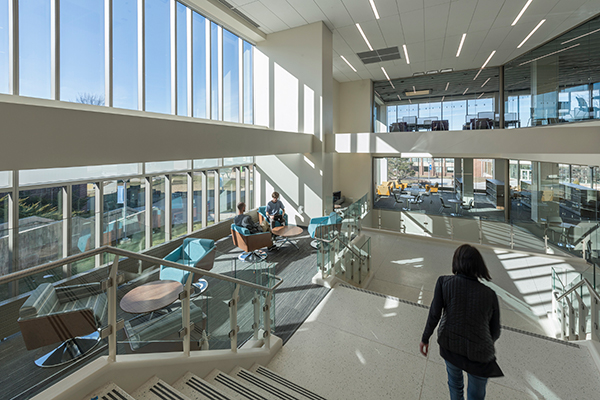
When students enter the building today, they are greeted by the “learning link,” an airy atrium/grand stair that unites the building’s three stories and displays Library activity. The learning link, which has seating bays at stair landing extensions, was designed as a sequential experience, and it makes the elevator feel like a secondary option.
According to Steingraeber, the landing extensions are “places to be seen and to see others passing by.”
Kowalk calls the learning link “a funnel that draws students into the building and embraces them, while creating a sense of mystery and discovery as they travel or gather within it.”
Initially, some students were surprised that they could not take the stairs continuously from the first floor to the third floor in the learning link atrium. But that was the design intent—to get to the third floor via the stairs, students must first enter the Library, then re-enter the atrium to access the third floor. This allows for one point of entry to the Library and forces students to engage the space . . . and when they see what it has to offer, some of them might just stick around.
The atrium also functions as a connecting space between Building L on the second floor and the quad on the first floor. Thus, it draws students into the Library from two directions.
The May rededication took place in the learning link. During his presentation, Sronkoski explained that the learning link atrium previously had structural concrete floors on all three levels. To create the three-story atrium volume, Pepper Construction had to remove over 5,000 square feet of concrete and bring in stair sections via a crane.
“This three-story atrium acts not only as a stairwell,” said Sronkoski, “but also as a point of reference so you always know where you are in the building.”
Have Fun
During planning, one Harper Library employee said, “Let’s have some fun with this.” That declaration inspired many design decisions.
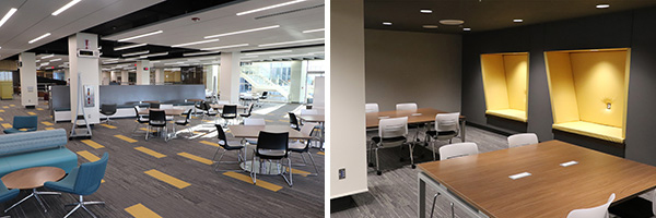
The design team started by turning to the brightest color: yellow gleams throughout the space, from the desk and seating area that welcomes students to the first floor Academic Support Center to the seating alcoves carved into third floor walls. Additionally, yellow carpet stripes draw attention to zones of energy and activity on all three floors.
The careful observer might note subtler playful gestures within the Library. The signage, for example, is oversized and quirky. The main Circulation/Research Assistance Desk on the second floor is called, “The Desk.” Go up a floor and you’ll find “The Other Desk.”
What About Quiet Space?
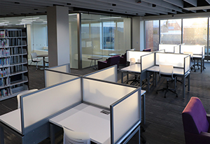
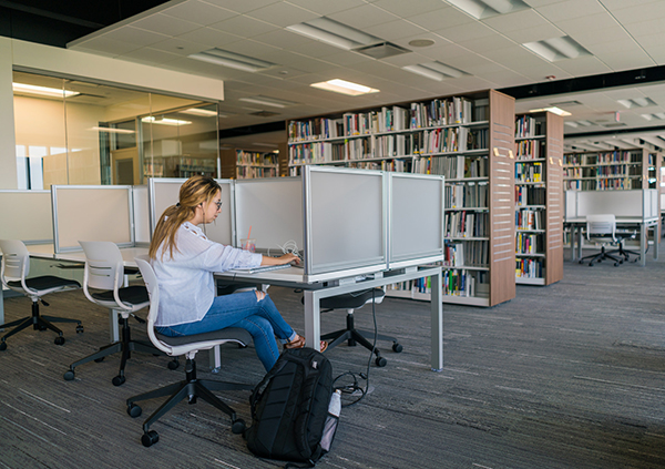
Despite the contemporary focus on collaboration, many students still want a place for uninterrupted study. The David K. Hill Family Library accommodates: the third and unofficial quiet floor offers a more traditional library setting.
Rather than using signs that exhort students to keep quiet, the Library relies on more indirect means to minimize conversations. For instance, almost all third-floor seating is either single or double. Additionally, most double seats are back-to-back to discourage talking. It’s a big difference from before, when designated quiet areas had prominent signs and tables with four seats.
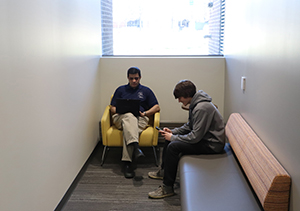
Realizing that taller stacks had to be on the third floor, Kowalk and the interiors team also carved out personal areas “so it doesn’t feel like you’re surrounded by an ocean of books.”
Students looking for quiet places on the first and second floors will still find plenty of options. The second (and third) floor offers blocks of study rooms, while throughout the Library, there are many nooks to find privacy, yet still be visible.
Nest Result
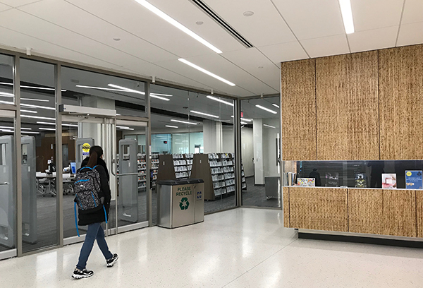
On some walls, a light material resembles the chaff or plant fiber that birds use to construct nests. The material is a panel made of recycled sorghum straw. Its use was inspired by one longtime Library employee, who said during programming that the Library has always felt like a nest to her. The panels’ nest-like appearance also gives a nod to Harper’s mascot: the hawk.
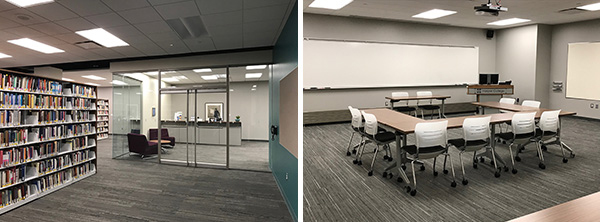
Academy for Teaching Excellence
Harper College has long supported staff improvement. Previously, its three teacher development programs were dispersed on the first floor. The renovation consolidates the programs in a single space on the third floor.
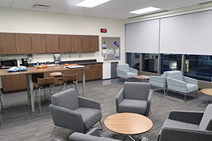
Brian Knetl said, “Our Academy for Teaching Excellence space reflects a collaborative approach to professional development with an experimental classroom, small group work areas, and a gathering space for faculty to engage in spontaneous discussions where we all know the best ideas are generated.”
The Academy’s new location in the southeast corner of the third floor also plays into Harper’s emphasis on student/teacher interface—it forces teachers to see and interact with students as they make their way to the Academy.
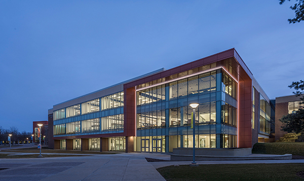
A Redefined Façade
The Library’s original north façade, with its set-back windows and thick bands of concrete, presented an unwelcoming face to the campus’s busy quad.
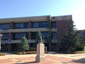
The renovation eliminated the setback by removing the existing windows and pushing out the new window wall to the perimeter of the building at the second and third floors, thus covering up the existing bands of concrete. Not only did this give the building a new, more sophisticated look, but it also created 3,500 square feet of additional Library floor area without building an addition.
“The modernized façade connects the Library’s two upper floors so that they appear to hover over the first floor,” said Steingraeber. “It also sparks a dialogue with the glass rotunda across the courtyard.”
Steingraeber and his team also incorporated a random mullion pattern on the upper floor windows to suggest books on a shelf.
An Eco-Friendly Makeover
When it comes to sustainability, the daylight that fills the renewed Library is just the tip of the iceberg. It starts with the very nature of the project—instead of razing the Library and building new, the project retained over 75% of the existing concrete structure and masonry walls.
Steingraeber said, “One of the primary objectives was to create a high-performing, energy-efficient building that improves occupant comfort and reduces operational expenses.”
The renovations are designed to meet Leadership in Energy and Environmental Design (LEED) Silver certification standards with the U.S. Green Building Council. Sustainable achievements range from energy-efficient mechanical systems and low-flow plumbing fixtures to recycled materials and high-performance glass.
The renovations reduce potable water consumption by 33% compared to a similarly sized building that meets baseline requirements, plus more than 90% of the materials removed during demolition were diverted from the landfill and recycled instead.
The Library is also the first all-LED lighted building on Harper’s campus. The system adjusts artificial light intensity based on how much daylight comes through the glass. Additionally, occupancy sensors automatically turn off lights when the space is unoccupied.
A New Spatial Focus
“Our taxpayers are grateful that every ounce of useful life was squeezed from this building over its 49 years of service,” said Board of Trustees Chair Greg Dowell at the rededication. “Taxpayers also know that the world is not static, and it’s critical to meet the needs of our students today, as well as in the future.”
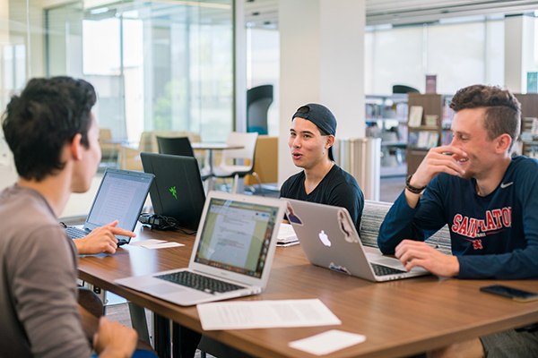
One such need is that of a “third place,” which Harper’s coordinator of collection development Kimberly Fournier introduced during planning. The term, coined by sociologist Ray Oldenburg in The Great Good Place, refers to a place without the structure of home (first place) or work (second place)—a coffee house, fitness center, or gym for example—where people can go to have conversations and be a part of something. Harper wanted to apply this concept so the renovated Library would become a third place on campus, without the structure of home or the classroom, and provide a new destination to help keep students on campus.
“The third place provided the context for each design decision,” said Sronkoski. “And now, this inviting, more informal environment is proving to fit well with how Harper’s students collaborate and use technology to connect and create. The shift from books and collections to people and collaboration has clearly provided the impetus for a new, enticing destination on campus.”
Evidence of that shift appears throughout the David K. Hill Family Library, whether it’s a duo working on a sociology assignment in the learning link stair bays, a student getting calculus tutoring in the Academic Support Center, or a team brainstorming a business project in the Information Commons.
Since the Library opened, students and community members have complimented everything from its vibrant colors and comfortable furniture to the many study space choices and the attentiveness of Library staff. According to Library employees, students also offer “non-verbal cues” about their impressions—after they have tried different areas, students often come back to their favorite spaces . . . just like third place regulars.
“You’re going to hear noise and see movement—that’s the idea,” said Kowalk. “It’s a place to study and get academic support, but it’s also a place to interact, explore, connect, create, or simply enjoy the views. It’s a home away from home.”
One of the most important things the rejuvenated Library brings to Harper students is connections . . . to the activity within, to the outdoors, to the staff, to the rest of the campus, and to each other.
From her old office, Njambi Kamoche had no view to the Harper Library’s interior. Now, in her new office, which is in the same location, she can see across the entire second floor.
“Everything is open and easy to find,” she said. “The barriers are gone.”
Contact us to learn more about academic library design, or comment below to share your thoughts on this post.
